


源文地址: 巧用Drawable 實現Android UI 元素間距效果
在大部分的移動UI或者Web UI都是基於網格概念而設計的。這種網格一般都是有一些對其的方塊組成,然後它們組合成爲一個塊。使用網格這樣的設計原則可以有助於對齊UI元素,提升UI的一致性,同時還能讓用戶更加容易的獲取UI上面包含的內容。簡而言之,網格是一個相當的強大的設計工具。
開發者在使用網格設計原則的時候需要在UI 元素之間添加一些額外的間距,比如padding、margin或者spacing(根據你的設計方案來選擇使用哪種間距) 。這些間距有利於在不同的塊之間設置清晰的分隔帶同時不會整體UI的可讀性。這些間距對我們Android 開發者來說也不陌生,我們在設計Android 界面時,也會使用View 的padding 和 margin 來達到類似的效果。在Android 開發中,爲了將UI 和業務邏輯分隔,我們會使用 XML來定義UI。這種做法對於比較固定的UI很有效果,但當這些UI元素需要根據業務邏輯來確定隱藏或者顯示的狀態時,這種做法就有點困難了。這篇文章就根據這種情況提出了一些Android開發技巧來應對動態的網格UI。
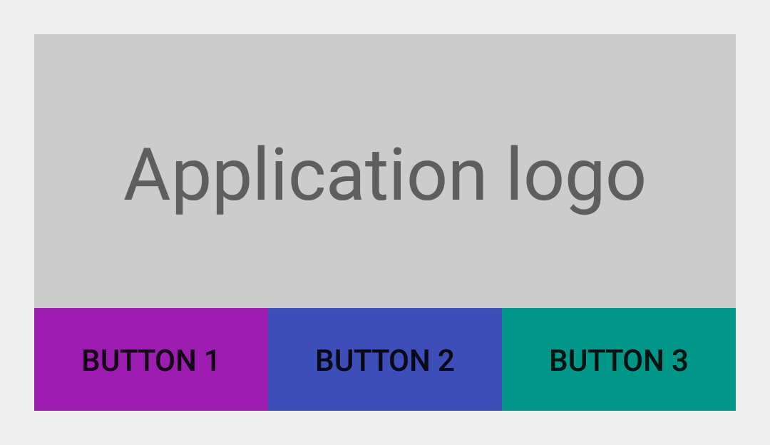
沒有間距的UI
首先讓我們來看一個簡單的例子。我們創建一個簡單的 LinearLayout 。然後我們在TextView (顯示“Application logo”)下方再內置一個 LinearLayout ,我們在其中水平依次放置3個Button。最後得到的效果圖如下圖所示:
<LinearLayout xmlns:android="http://schemas.android.com/apk/res/android"
    android:layout_width="match_parent"
    android:layout_height="wrap_content"
    android:orientation="vertical"
    android:padding="@dimen/spacing_medium">

    <TextView
        android:layout_width="match_parent"
        android:layout_height="128dp"
        android:background="@color/light_gray"
        android:gravity="center"
        android:text="@string/application_logo"
        android:textAppearance="@android:style/TextAppearance.Material.Display1" />

    <LinearLayout
        android:id="@+id/buttons_container"
        android:layout_width="match_parent"
        android:layout_height="wrap_content"
        android:orientation="horizontal">

        <Button
            android:id="@+id/btn_first"
            android:layout_width="0dp"
            android:layout_height="wrap_content"
            android:layout_weight="1"
            android:background="@drawable/purple"
            android:text="@string/button_1" />

        <Button
            android:id="@+id/btn_second"
            android:layout_width="0dp"
            android:layout_height="wrap_content"
            android:layout_weight="1"
            android:background="@drawable/indigo"
            android:text="@string/button_2" />

        <Button
            android:id="@+id/btn_third"
            android:layout_width="0dp"
            android:layout_height="wrap_content"
            android:layout_weight="1"
            android:background="@drawable/teal"
            android:text="@string/button_3" />

    </LinearLayout>

</LinearLayout>
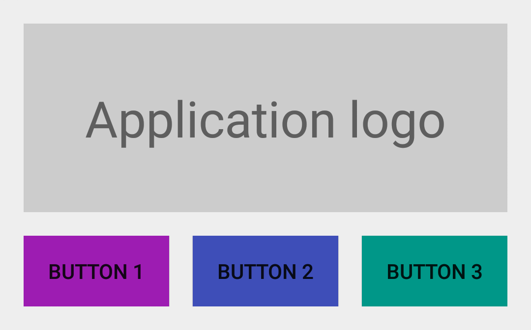
添加間距後的UI
上圖的所展示的UI就是基於網格設計的。當時UI裏面的元素之間都沒有間距。爲了讓用戶更好地區分這些UI元素,我們給id 爲 @id/buttons_container 的 LinearLayout 添加屬性 android:layout_marginTop="@dimen/spacing_medium" ;給id 爲 @id/btn_first 和@id/btn_second 的兩個 Button 分別添加屬性 android:layout_marginRight="@dimen/spacing_medium" ;這時的UI效果如下圖所示:
添加了間距之後,整體的UI效果好多了,可讀性更強了。可當我們動態的隱藏某些 View 的時候就會出現一些問題了。我們假設第三個Button 會根據用戶的設備是否安裝了 Google Play Services 來決定它的展示。如果這個設備沒有 Google Play Services,那我們就把這個 Button to View.GONE 的 visibility 屬性設爲 View.GONE, 所得效果如下圖:
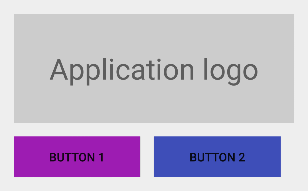
出來的效果與我們預料中的一樣,第三個 Button 沒有再顯示了,但是第二個 Button 的右邊沒有與上面的TextView 右邊對齊。出現這種問題的原因是:擁有 margin 屬性的view 會認爲margin相應方向存在鄰接 view。例如,每個擁有right/top margin view會認爲它的 right/top 方向有一個鄰接 view,因此,這個對應 margin 也就會生效,就算這個鄰接view已經隱藏了。
設置間距的折衷方案——Java 和 GridLayout
一個比較直接的解決方案就是在Java 代碼裏面手動改變相應的margin 值,但說實話這不是一個好的方案。另一個方案就是使用能夠自動處理元素之間的間距的佈局。GridLayout 就符合這樣的要求。但是這個佈局讓人蛋疼的是元素之間的間距不能自定義,只能使用默認的間距。
設置間距的最佳方案——LinearLayout 的divider
實際上 LinearLayout 已經有一個處理這種元素之間的間距的屬性了。這個屬性卻沒怎麼被大家發現,一直很低調,但它的效果相當神奇。所以我們說的第三個方案就是使用一個固定高寬的 Drawable 作爲 LinearLayout 的 元素分隔線(divider):
<?xml version="1.0" encoding="utf-8"?>
<shape xmlns:android="http://schemas.android.com/apk/res/android"
    android:shape="rectangle">

    <size
        android:width="@dimen/spacing_medium"
        android:height="@dimen/spacing_medium" />

    <solid android:color="@android:color/transparent" />

</shape>
現在你就可以把這個新創建的 Drawable 設爲LinearLayout 的 divider,這樣這個Drawable 就能讓元素之間產生間距了:
<LinearLayout xmlns:android="http://schemas.android.com/apk/res/android"
    android:layout_width="match_parent"
    android:layout_height="wrap_content"
    android:divider="@drawable/spacer_medium"
    android:orientation="vertical"
    android:padding="@dimen/spacing_medium"
    android:showDividers="middle">

    <!-- TextView -->

    <LinearLayout
        android:id="@+id/buttons_container"
        android:layout_width="match_parent"
        android:layout_height="wrap_content"
        android:divider="@drawable/spacer_medium"
        android:orientation="horizontal"
        android:showDividers="middle">

        <!-- Buttons -->

    </LinearLayout>

</LinearLayout>

總結
Android 框架裏面有許多的特性可以用來實現一些不常見的方案,而且最後效果出其不意。定義 Drawable 就是其中一種途徑。如果你能吃透Android 裏面的 Drawable ,那麼你的代碼也可能大大地精簡。
注意:文章LinearLayout的divider 屬性設置是Android API 11 之後加進去的,這意味着Android API 11之前的設備要使用這個divider需要LinearLayoutCompat。
本文翻譯自:Grid
Spacing on Android 原文作者:Cyril
Mottier