


1.爲什麼要用flex進行webapp佈局
第一,float佈局 需要清除浮動,很麻煩。
第二,絕對定位需要考慮位置和空間佔位
第三,元素垂直水平居中問題。
2.網易雲音樂首頁分析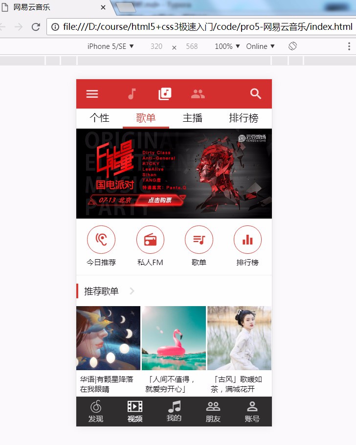
3.啥也別說,直接上代碼
先來一個html,
<!DOCTYPE html>
<html lang="en">
<head>
    <meta charset="UTF-8">
    <meta name="viewport" content="width=device-width, initial-scale=1.0">
    <meta http-equiv="X-UA-Compatible" content="ie=edge">
    <title>001</title>
</head>
<body>
   <div id="app">
       <div id="header"></div>
       <div id="navbar"></div>
       <div class="routerview">
           <div id="banner"></div>
           <div id="recommend-items"></div>
           <div class="reco-list"></div>
       </div>
       <div id="footer"></div>
   </div>
</body>
</html>
別的不說咱們先用色塊把各部分堆出來,這個跟flex沒半毛錢關係,只是用了rem.
html{
    font-size: 100px;
}
#header{
    background-color: #d32f2f;
    min-height: 0.48rem;
    position: fixed;
    top: 0;
    left: 0;
    right: 0;
    z-index: 1000;

}
#navbar {
    position: fixed;
    top: 0.48rem;
    left: 0;
    right: 0;
    z-index: 1000;
    background: #ccc;
    min-height: 0.3rem;

}

#footer {
    height: 0.49rem;
    background: #2f2d2e;
    width: 100%;
    position: fixed;
    bottom: 0;
    left: 0;
    color: rgba(255, 255, 255, .87);
    font-size: 0.12rem;
}

.routerview {
    padding-bottom: 0.49rem;
}
.routerview {
    position: absolute;
    left: 0;
    top: 0.81rem;
    width: 100%;
    height: 2000px;
    background: #eeeeee;
}
接着往下就是重點了,我們來看看頭部細節細節,左右圖標,
       <div id="header">
        <div class="logo"></div>
        <div class="logo"></div>
       </div>
css部分,
#header{
    align-items: center;
    justify-content: space-between;
}
那中間部分三個等距怎麼辦?
html,
<div id="header">
    <div class="logo"></div>
    <div class="title">
    <div class="logo"></div>
    <div class="logo"></div>
    <div class="logo"></div>
    </div>
    <div class="logo"></div>
</div>
上css,
.title {
    display: flex;
    justify-content: center;
}
結果如下: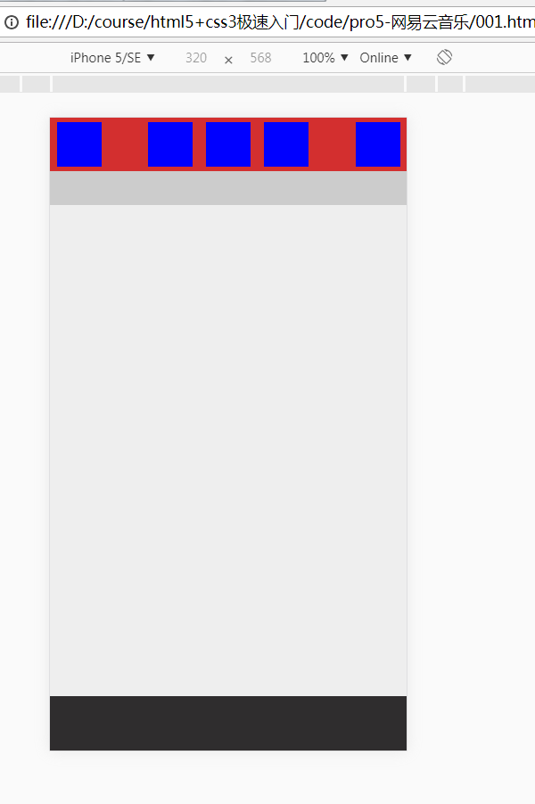
最複雜的部分已經結束了,剩下的就很OK了。
最後給大家三個小嚐試吧。
1.剩下的部分切出來。
2.解決動態的多屏幕適配問題(提示:js+rem動態計算)
//參考代碼:
function getRem(pwidth,prem){
    var html = document.getElementsByTagName("html")[0];
    var oWidth = 2*document.body.clientWidth || document.documentElement.clientWidth;
    html.style.fontSize = oWidth/pwidth*prem + "px";
}
3.flex兼容性(提示:postcss)
·END·