


好程序員web前端學習路線分享純css繪製各種圖形,很多時候,UI設計師爲了頁面的好看,都會採用很多圖形去做裝飾,比如三角形、矩形、圓形、橢圓形、對話泡泡等,讓整個頁面看起來不會太單調。作爲前端開發更多的時候,會採用比較快捷的實現方式就是用圖片或者背景圖來實現頁面效果,但是有一個很大的問題就是圖片可能會失真,有些情況也會發現用圖片或者背景圖去實現效果靈活度也不夠。那麼如果不用圖片,用純CSS也是可以繪製各種圖形的,很多人都以爲css只能寫一些簡單的圖形,比如長方形、正方形、圓形、橢圓,其實不然,強大的css不僅可以繪製出基本的圖形,還可以繪製一些比較複雜一些的比如愛心、鑽石、太極八卦、對話泡泡等。這些效果的實現,會用到CSS3的相關屬性,大家都知道css3屬性對於瀏覽器的兼容不是很好,所以我希望模仿這些效果的時候,可以用Chrome和firefox瀏覽器打開,雖然IE也可以看到部分效果,但是爲了更好的視覺體驗,還是不要用IE去看了,好了,廢話不多說,來一起看看CSS繪製的那些圖形吧。
1、 向上三角形
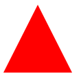
CSS核心代碼
.triangle-up {
width: 0;
border-left: 50px solid transparent;
border-right: 50px solid transparent;
border-bottom: 100px solid red;
}
2、 左上三角形
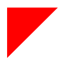
CSS核心代碼
.triangle-topleft {
width: 0;
border-top: 100px solid red;
border-right: 100px solid transparent;
}
3、 弧形尾箭頭
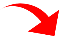
CSS核心代碼
.curvedarrow {
position: relative;
width: 0;
border-top: 90px solid transparent;
border-right: 90px solid red;
transform: rotate(10deg) translateX(100%);
}
.curvedarrow:after {
content: "";
position: absolute;
border: 0 solid transparent;
border-top: 30px solid red;
border-radius: 200px 0 0 0;
top: -120px; left: -90px;
width: 120px; height: 120px;
transform: rotate(45deg);
}
4、 吃豆人

CSS核心代碼:
.pacman {
width: 0px; height: 0px;
border-right: 60px solid transparent;
border-top: 60px solid red;
border-left: 60px solid red;
border-bottom: 60px solid red;
border-top-left-radius: 60px;
border-top-right-radius: 60px;
border-bottom-left-radius: 60px;
border-bottom-right-radius: 60px;
}
5、 帶尖角的說話泡泡
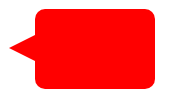
CSS核心代碼:
.talkbubble {
width: 120px; height: 80px;
background: red;
position: relative;
border-radius: 10px;
}
.talkbubble:before {
content: "";
position: absolute;
right: 100%; top: 26px;
border-top: 13px solid transparent;
border-right: 26px solid red;
border-bottom: 13px solid transparent;
}
6、bilibili電視機
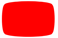
CSS核心代碼
.tv {
position: relative;
width: 200px; height: 150px;
margin: 20px 0;
background: red;
border-radius: 50% / 10%;
color: white;
text-align: center;
text-indent: .1em;
}
.tv:before {
content: '';
position: absolute;
top: 10%; bottom: 10%; right: -5%; left: -5%;
background: inherit;
border-radius: 5% / 50%;
}
7、放大鏡

.magnifying-glass {
font-size: 10em;
display: inline-block;
width: 0.4em; height: 0.4em;
border: 0.1em solid red;
position: relative;
border-radius: 0.35em;
}
.magnifying-glass:before {
content: "";
display: inline-block;
position: absolute;
right: -0.25em; bottom: -0.1em;
border-width: 0;
background: red;
width: 0.35em; height: 0.08em;
transform: rotate(45deg);
}
8、長長的指向圖形

CSS核心代碼:
.pointer {
width: 200px; height: 40px;
position: relative;
background: red;
}
.pointer:after {
content: "";
position: absolute;
left: 0; bottom: 0;
border-left: 20px solid white;
border-top: 20px solid transparent;
border-bottom: 20px solid transparent;
}
.pointer:before {
content: "";
position: absolute;
right: -20px; bottom: 0;
border-left: 20px solid red;
border-top: 20px solid transparent;
border-bottom: 20px solid transparent;
}
最後還是要跟小夥伴們強調一下,由於部分圖形效果使用了CSS3的部分屬性,如果你還在使用IE的話,我建議你使用現代瀏覽器,比如:Mozilla Firefox、Google Chrome、Safari、Opera。上面展示的效果可能部分實用性不大,但是使用css製作三角和圓有效果應用還是很多了,特別是用來製作tips效果。