


<!DOCTYPE html>
<html>
<head>
<meta charset="utf-8">
<style>
body {
margin: 0;
}
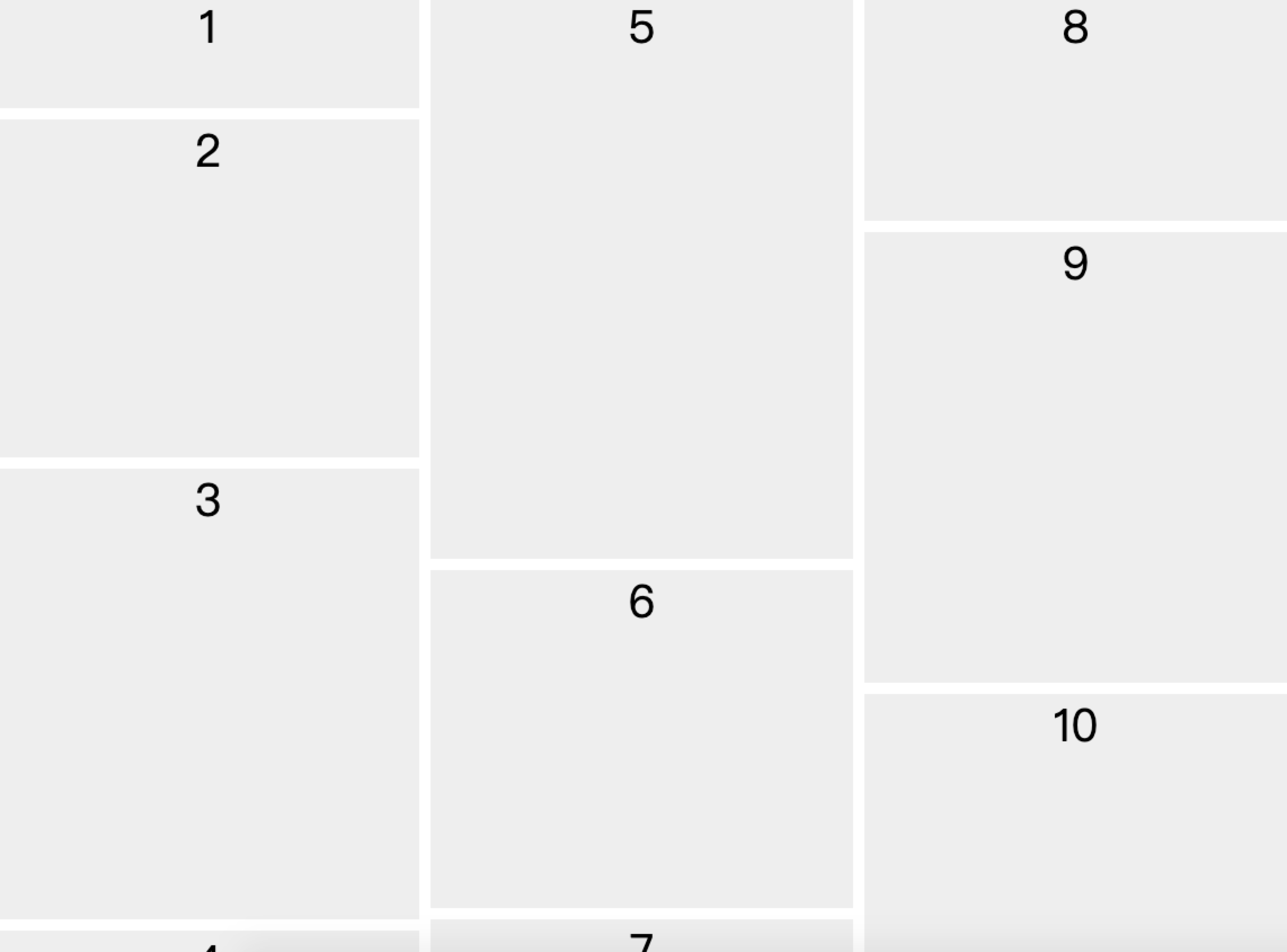
.container {
/* 分幾列 */
column-count: 3;
/* 每列之間的距離 */
column-gap: 10px;
}
.item {
/* 避免當前元素的中斷點 */
break-inside: avoid-column;
width: 100%;
margin-bottom: 10px;
background: #eee;
text-align: center;
color: black;
font-size: 40px;
}
</style>
</head>
<body>
<div class="container">
<div class="item" style="height: 100px">1</div>
<div class="item" style="height: 300px">2</div>
<div class="item" style="height: 400px">3</div>
<div class="item" style="height: 100px">4</div>
<div class="item" style="height: 500px">5</div>
<div class="item" style="height: 300px">6</div>
<div class="item" style="height: 400px">7</div>
<div class="item" style="height: 200px">8</div>
<div class="item" style="height: 400px">9</div>
<div class="item" style="height: 500px">10</di>
</div>
</body>
</html>效果圖