


原文首發於微信公衆號:躬行之(jzman-blog)
Material Design 設計規範在 Google I/O 2014 推出,這種設計理念一經推出就受到廣大開發者的喜愛,主要側重於紙墨化創作和突出設計的實體感,使得設計更接近於真實世界,力求平滑、連續的交互方式與用戶體驗,這種設計規範更能促進 Android 生態系統的發展,爲此,Google 提供了一系列的符合 Material Design 風格的控件,如 FloatingActionButton、Snackbar、TabLayout 等。雖然經常在開發中用到,但是沒有做記錄,打算從頭開始記錄一下這些組件的使用,今天說一下 CoordinatorLayout 和 FloatingActionButton 相關的知識。
CoordinatorLayout
CoordinatorLayout 是一個加強版的 FramLayout,意味着如果不加任何限制,在 CoordinatorLayout 裏面的子 View 都會默認出現在左上角,CoordinatorLayout 有兩個主要的使用方式:
- 作爲應用的頂層佈局
- 作爲與一個或多個子 View 交互的容器
可爲 CoordinatorLayout 裏面的子 View 指定 Behavior,就在單個父佈局中提供許多不同的交互效果,子 View 之間也可以相互交互,CoordinatorLayout 可以使用 CoordinatorLayout.DefaultBehavior 註解來指定子 View 的默認行爲,總之,可以藉助 CoordinatorLayout 實現不同的滾動效果。
FloatingActionButton
FloatingActionButton 是 Material Design 類型的按鈕控件,一般表現是浮動在 UI 上層的圓形圖標,有自己的 behavior 並可以設置錨點。
FloatingActionButton 有兩種大小,分別是 normal(56dp) 和 mini(40dp) ,默認是 mini(40dp),其大小可以通過屬性 fabSize 來指定需要的大小,當然也可以設置 fabSize 爲 auto,系統會根據不同的屏幕選擇合適的大小。
FloatingActionButton 間接繼承 ImageView,可以使用如下方式在代碼中設置圖標:
//設置圖標
fab.setImageDrawable(getResources().getDrawable(R.drawable.fab));
fab.setImageResource(R.drawable.fab);
FloatingActionButton 的背景顏色默認是主題的 colorAccent 表示的值,在代碼中可以通過如下方式修改 FloatingActionButton 的背景顏色,具體如下:
//設置背景顏色
fab.setBackgroundTintList(ColorStateList.valueOf(Color.parseColor("#000000")));
可以通過如下方式設置 FloatingActionButton 的大小,具體如下:
//設置大小
fab.setSize(FloatingActionButton.SIZE_MINI);
那麼,如何自定義 FloatingActionButton 的大小呢,可以從 FloatingActionButton 部分源碼中看到決定其大小的尺寸是定義到 dimens 文件中的,具體由 design_fab_size_mini 和 design_fab_size_normal 來決定,部分代碼如下:
//源碼
private int getSizeDimension(@Size final int size) {
    final Resources res = getResources();
    switch (size) {
        case SIZE_AUTO:
            // If we're set to auto, grab the size from resources and refresh
            final int width = res.getConfiguration().screenWidthDp;
            final int height = res.getConfiguration().screenHeightDp;
            return Math.max(width, height) < AUTO_MINI_LARGEST_SCREEN_WIDTH
                    ? getSizeDimension(SIZE_MINI)
                    : getSizeDimension(SIZE_NORMAL);
        case SIZE_MINI:
            return res.getDimensionPixelSize(R.dimen.design_fab_size_mini);
        case SIZE_NORMAL:
        default:
            return res.getDimensionPixelSize(R.dimen.design_fab_size_normal);
    }
}
所以只需要創建 dimens 文件夾,在裏面重新設置 design_fab_size_mini 和 design_fab_size_normal 的值即可自定義 FloatingActionButton 的大小了,具體如下:
/**dimens.xml**/
<?xml version="1.0" encoding="utf-8"?>
<resources xmlns:tools="http://schemas.android.com/tools">
    <dimen name="design_fab_size_mini" tools:override="true">20dp</dimen>
    <dimen name="design_fab_size_normal" tools:override="true">100dp</dimen>
</resources>
當然 FloatingActionButton 間接繼承 ImageView,ImageView 的一些屬性肯定可以使用,這裏就不在說了。
FloatingActionButton 的屬性
下面是一些常用的屬性,具體如下:
android:src             //設置圖標(24dp)
app:backgroundTint      //設置圖標背景顏色。
app:rippleColor         //設置點擊時水波紋顏色
app:elevation           //設置陰影大小
app:fabSize             //設置大小
app:pressedTranslationZ //按下時距離Z軸的距離
app:layout_anchor       //設置錨點
app:layout_anchorGravity//設置相對錨點的位置
關於屬性,瞭解一下,具體使用時設置後觀察效果不失爲一種直觀的學習方式。
簡單使用
總覺得做筆記還是有效果圖比較好,那就簡單使用 CoordinatorLayout 和 FloatingActionButton 看一下具體效果,佈局如下:
<?xml version="1.0" encoding="utf-8"?>
<android.support.design.widget.CoordinatorLayout xmlns:android="http://schemas.android.com/apk/res/android"
    xmlns:tools="http://schemas.android.com/tools"
    android:layout_width="match_parent"
    android:layout_height="match_parent"
    xmlns:app="http://schemas.android.com/apk/res-auto"
    tools:context="com.manu.materialdesignsamples.samples.SampleActivity">

    <android.support.v7.widget.RecyclerView
        android:id="@+id/rvData"
        android:layout_width="match_parent"
        android:layout_height="wrap_content"
        android:layout_marginStart="12dp"
        android:layout_marginEnd="12dp"
        android:visibility="visible"/>

    <android.support.design.widget.FloatingActionButton
        android:id="@+id/fab"
        android:layout_width="wrap_content"
        android:layout_height="wrap_content"
        android:layout_margin="12dp"
        android:layout_gravity="bottom|end"
        android:src="@drawable/fab"
        android:scaleType="center"
        app:backgroundTint="@color/colorAccent"
        app:backgroundTintMode="src_in"
        app:elevation="5dp"
        app:rippleColor="#000000"
        app:fabSize="auto"
        app:pressedTranslationZ="10dp"/>

</android.support.design.widget.CoordinatorLayout>
然後在設置 FloatingActionButton 的點擊事件,具體如下:
findViewById(R.id.fab).setOnClickListener(new View.OnClickListener() {
    @Override
    public void onClick(View v) {
        Snackbar.make(v,"我是Snackbar...",Snackbar.LENGTH_SHORT)
                .setAction("取消", new View.OnClickListener() {
                    @Override
                    public void onClick(View v) {
                        Toast.makeText(SampleActivity.this, "取消", Toast.LENGTH_SHORT).show();
                    }
                }).show();
    }
});
先來一張效果圖,具體如下:
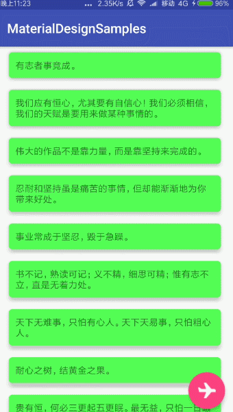
可知 FloatingActionButton 會自動給 Snackbar 留出位置,避免 Snackbar 彈出時遮擋 FloatingActionButton,因爲在 FloatingActionButton 內部已經實現了使用 Snackbar 對應的 Behavior,CoordinatorLayout 會根據對應的 Behavior 的具體表現自動調整子 View 的位置,這裏當然是 FloatingActionButton 的位置,可以試一試將根佈局設置爲 RelativeLayout 等,當然,此時 Snackbar 彈出時會遮擋 FloatingActionButton,顧名思義 CoordinatorLayout 就是協調佈局,關於 Behavior 這部分留到後面整理。
可以選擇關注微信公衆號:jzman-blog 獲取最新更新,一起交流學習!